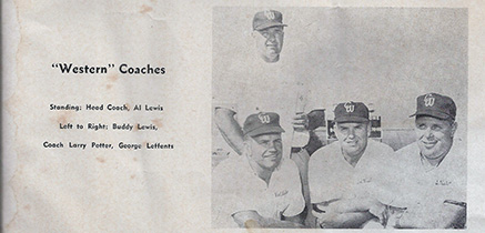
1961
| Link to Program Roster | ||
Need Information |
||
| 10 | Al Madison | HB |
| 11 | Larry Toledo | QB |
| 14 | Rod Brown | HB |
| 15 | Jim Hombs | QB |
| 19 | Larry Bottom | QB |
| 20 | Chuck Cota | HB |
| 21 | Jesse Murdock | HB |
| 23 | Jerry Hombs | HB |
| 24 | Jim Barret | HB |
| 26 | Larry Hancock | HB |
| 28 | Tim Short | FB |
| 30 | Gil "Pancho" Navarro | FB |
| 33 | Jack Duby | FB |
| 40 | Larry Slover | HB |
| 44 | Rick Starek | HB |
| 48 | Birney Groom | FB |
| 50 | Joe Spaulding | C |
| 53 | Dave Bartlett | C |
| 55 | Joe Lutes | C |
| 56 | John Shoemaker | C |
| 60 | Bob Rhineholt | G |
| 61 | Howard Cook | G |
| 62 | Carl Thurow | G |
| 63 | John Giliam | G |
| 66 | Terry Love | G |
| 67 | Dick Hopkins | G |
| 68 | Dave Swain | G |
| 70 | Ben Cipranic | T |
| 71 | Jerry LaRusse | T |
| 72 | Phil Stewart | T |
| 73 | Cleve Pell | T |
| 74 | Austin Brown | T |
| 77 | Dave Burrows | T |
| 78 | Dave Price | T |
| 80 | Uvaldo Martinez | E |
| 81 | Ken Keagy | E |
| 82 | Bob Dovgin | E |
| 83 | Graham Bell | T |
| 84 | Russ Shubert | E |
| 85 | Ron Damschen | E |
| 88 | Terry Greeson | E |
| Jesse Murdock | ||
| Tom Holmes | ||
Be aware that the CSS for these layouts is heavily commented. If you do most of your work in Design view, have a peek at the code to get tips on working with the CSS for the liquid layouts. You can remove these comments before you launch your site. To learn more about the techniques used in these CSS Layouts, read this article at Adobe's Developer Center - http://www.adobe.com/go/adc_css_layouts.
Clearing Method
Because all the columns are floated, this layout uses a clear:both declaration in the .footer rule. This clearing technique forces the .container to understand where the columns end in order to show any borders or background colors you place on the .container. If your design requires you to remove the .footer from the .container, you'll need to use a different clearing method. The most reliable will be to add a <br class="clearfloat" /> or <div class="clearfloat"></div> after your final floated column (but before the .container closes). This will have the same clearing effect.
Logo Replacement
An image placeholder was used in this layout in the .header where you'll likely want to place a logo. It is recommended that you remove the placeholder and replace it with your own linked logo.
Be aware that if you use the Property inspector to navigate to your logo image using the SRC field (instead of removing and replacing the placeholder), you should remove the inline background and display properties. These inline styles are only used to make the logo placeholder show up in browsers for demonstration purposes.
To remove the inline styles, make sure your CSS Styles panel is set to Current. Select the image, and in the Properties pane of the CSS Styles panel, right click and delete the display and background properties. (Of course, you can always go directly into the code and delete the inline styles from the image or placeholder there.)
Internet Explorer Conditional Comments
These liquid layouts contain an Internet Explorer Conditional Comment (IECC) to correct two issues.
- Browsers are inconsistent in the way they round div sizes in percent-based layouts. If the browser must render a number like 144.5px or 564.5px, they have to round it to the nearest whole number. Safari and Opera round down, Internet Explorer rounds up and Firefox rounds one column up and one down filling the container completely. These rounding issues can cause inconsistencies in some layouts. In this IECC there is a 1px negative margin to fix IE. You may move it to any of the columns (and on either the left or right) to suit your layout needs.
- The zoom property was added to the anchor within the navigation list since, in some cases, extra white space will be rendered in IE6 and IE7. Zoom gives IE its proprietary hasLayout property to fix this issue.
Backgrounds
By nature, the background color on any div will only show for the length of the content. This means if you're using a background color or border to create the look of a side column, it won't extend all the way to the footer but will stop when the content ends. If the .content div will always contain more content, you can place a border on the .content div to divide it from the column.
